Converting a 1930s warehouse into a contemporary workspace
The strong industrial character and generous interior spaces of this former inner city warehouse became the inspiration for a contemporary office fit-out.
The two-storey brick building, and the remnants of its industrial past, were an adventurous starting point for a design approach that has retained existing heritage fabric and incorporated a striking contemporary addition.
The client and builder, a construction company, recognised the potential in the inner city site and its existing historical structures, deciding to keep much of the old building fabric and add on new services and facilities to create the company’s Sydney headquarters.
The new scheme provides a light-filled contemporary workspace made richer through its retained historical fabric. A strongly industrial-looking contemporary addition to the brick warehouse provides new entry space, new services, and brings light into the original structure. Its bold colour and contrasting form and geometry complement and enliven the older building and remnant street walls, and make an eye-catching addition to the streetscape.
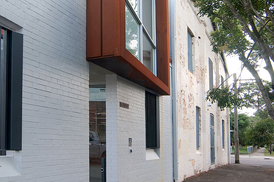
Recognising potential in an old brick warehouse
The two-storey brick warehouse, formerly a tannery school, had been unoccupied for several years and was in poor condition, with some elements damaged through neglect or vandalism.
Although not listed as a heritage item, the owners and the architect recognised the old building as a valuable base from which to develop something appropriate and appealing. On a corner site with two-storey facades lining both streets, the existing building had a strong street presence, and a walled open area alongside the warehouse offered room for a new addition. The structure of the warehouse was still robust and usable, with impressive exposed timber bearers and joists, cross-bracing, and timber trusses spanning large interior spaces.
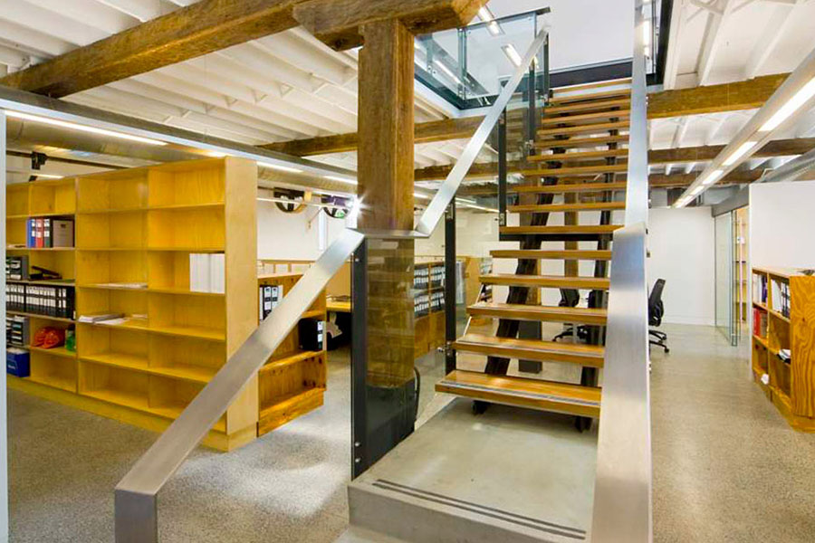
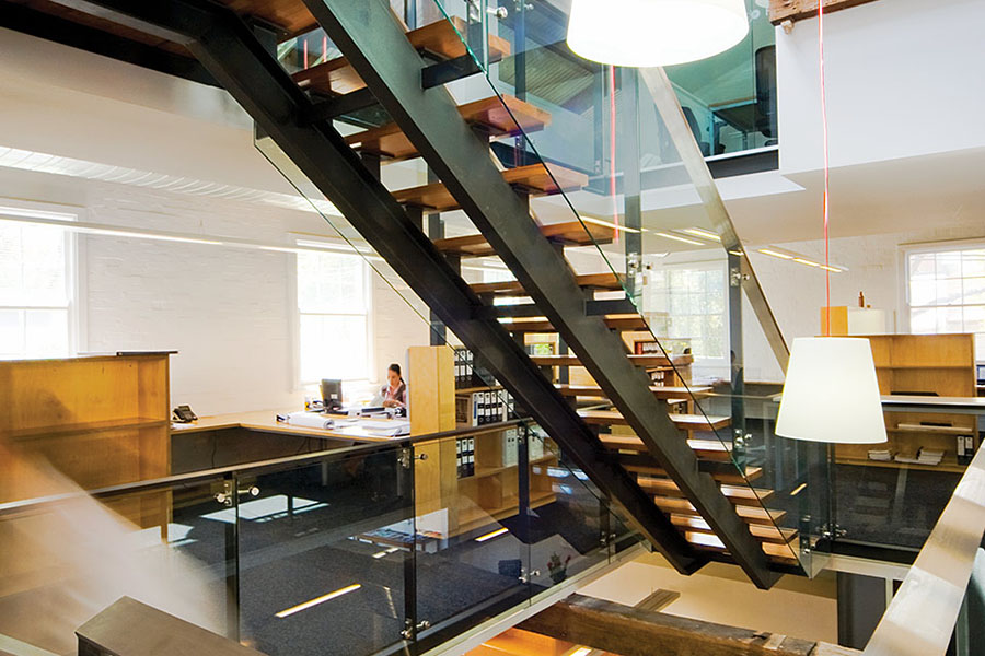
Other appealing historical features included elements of original industrial machinery that remained in some parts of the building, such as wheels and shafts, and areas of uncovered original paintwork. It was decided to retain these elements as features within the new spaces, celebrating the building’s industrial heritage while creating contemporary open-plan office space. The owner and architect developed a scheme based on retaining the warehouse structure intact and re-fitting it with a new, contemporary interior.
The Old Tannery, a stout brick factory-style edifice built for the training of tanners in the 1930s, enjoys no official heritage status. Our clients, however, viewed it differently. Kane Constructions is a building company that pursues unusual and inventive building projects and they wanted their Sydney office building to reflect this.
Linley Hindmarsh, Architect
Meeting the brief
To reflect its commitment to high-quality, innovative construction projects, the client sought a non-standard building for its Sydney headquarters.
As well as meeting rooms and office space for 17 staff, the design brief required new amenities including a kitchen, an impressive foyer, adequate car and bicycle parking, equitable access, and a means of identifying the company from the street without using overt street signage. Those aspects that couldn’t be located within the original building were achieved through the new addition, while also leaving ample area for off-street car parking.
As the client was also the builder, there was a very easy interface between client and architect. They wished to demonstrate the quality of workmanship that could be expected of their company, and were therefore open to a sophisticated design that did not rely on standard construction.
Linley Hindmarsh, Architect
Adding on in a bold manner
The new two-storey building alongside the old warehouse provides the new entry foyer, circulation spaces, services, and café and meeting room.
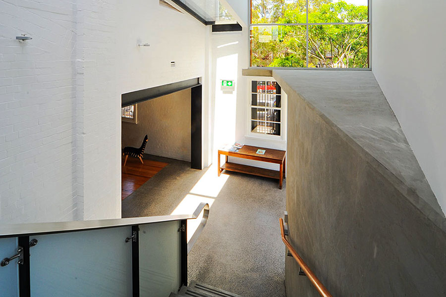
The relationship between the buildings is displayed in the use of materials and detailing at the points where the buildings connect, such as the internal staircase, where the balustrade and handrail have been used to express the difference between the old and new.
Rather than mimicking the warehouse in character or detailing, the addition is a sculptural “double wedge” that is clearly distinguished from the older building through its striking and unusual angular form and its orange-coloured, weathered steel exterior cladding, in stark contrast to the white-painted brickwork of the warehouse.
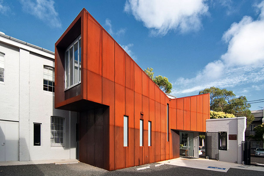
Adding to this contrast, the butterfly roof of the new wing is an inversion of the pitched roof of the warehouse. At one point along the street front the “wedge” steps over and through an older brick facade, marking the entry.
Although the contrast between the old and new is so bold, the scale, playful form, and industrial materials of the new addition make a good fit with the older neighbour, and the strong independent shape of both buildings can be clearly appreciated from the street.
Designing for sustainability
Environmental sustainability was an important goal for the construction process and the ongoing life of the building, with a focus on minimising use of energy and resources.
The new entry building screens the older building from western summer sun, reducing the heat load on the office spaces. The warehouse’s original sash windows were kept, allowing natural cross-ventilation to help cool the interiors. The original windows also provide good natural lighting, and this has been boosted with the addition of skylights. New rotating roof vents have been installed in the ridge, ejecting warm air that rises from all three interior levels. New tanks store rainwater collected from the roof, which is used on site.
Lessons learnt
The client, also the builder, worked closely with the architect to create a sustainable and desirable contemporary workspace that retains a high level of original fabric and celebrates the site’s history. Some of the features that were retained would not appeal to some clients, such as the old timber posts which had a strong influence on the layout of interior spaces, the remnant machinery, or the layers of previous paint schemes. However, the client and architect embraced these features and the result is an engaging and functional workspace.
We've had very positive responses from the occupants of this office building. Perhaps the lesson here is that offices do not have to feel brand new to be efficient and successful.
Linley Hindmarsh, Architect
