Reconfiguring a group of 19th century warehouses to extend and upgrade their function as a community centre
In 2016 the City of Sydney completed the renewal of the Juanita Nielsen Community Centre. Housed in a heritage-listed warehouse in the inner city suburb of Woolloomooloo, the Centre provides facilities for a diverse range of community-based activities including events, exhibitions, classes, workshops, meetings, and childcare. The building’s heritage fabric has been retained and its history celebrated in this award-winning project.
Built in 1888, the masonry building that now houses the Juanita Nielsen Community Centre was once six separate, two-storey warehouses built in the Victorian Regency style. The building’s past uses include warehouses for the shipping trade and local industry, and it was also home to the Woolloomooloo Free Kindergarten in the early 20th century.
The building was converted to a community centre in 1983 and officially named after Juanita Nielsen, a famous local activist who lost her life while campaigning for urban conservation in the 1970s.
The multipurpose recreation centre had became a much-loved meeting place for the local community, to the point where it had outgrown its facilities. In 2015 the City of Sydney embarked on a major refurbishment and upgrade of the centre to make it more accessible, useful, and welcoming for the whole community, and to acknowledge the historical and continuing Indigenous occupation of this site.
The architects’ approach was based on achieving this while also revealing the historic fabric of the building. The building’s performance and functionality has been improved, and its uses have expanded, without changing its fundamental structure and character.
We believe that for many people there is a comfort in things that have endured. At every opportunity, the age and stories of the building have been revealed and amplified. So, we worked the architecture to rejuvenate the existing building as a social place without sanitising or gentrifying it.
Rachel Neeson Neeson Murcutt Architects
Opening up the building’s interior
Vibrancy, safety, and accessibility were at the core of the initiative to renew the community centre. In response to this, architects Neeson Murcutt have re-orientated the main entry, re-organised the circulation, and opened visual access across interior spaces and out to the surrounding streets.
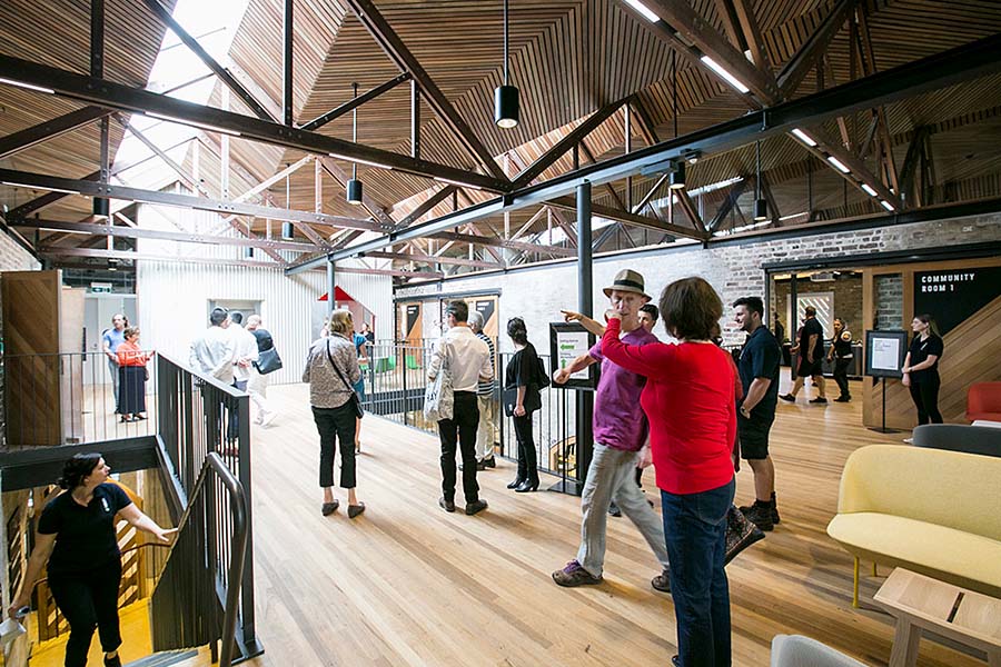
The architects embraced the potential openness of the building’s warehouse form. Openings to the street have been reinstated, and divisions between internal spaces have been removed by opening up blind brick archways that once divided the structure into six separate warehouses. Amenities and offices have been consolidated along one edge, maximising visibility across the entire ground floor. A new concrete floor has been laid, creating level access and bringing unity to the ground-floor spaces.

A warmth and lightness of touch permeate the many strategies brought by the architects to the transformation of these interconnected warehouses … The main entry and foyer are deliberately understated to ensure safe and welcoming access by all members of this diverse community. The material palette carefully reveals and respects the rawness of the original warehouse brick and timber with refined detailing. In this building the community can take pride in itself, both literally via a pleasing transparency and through representation of a versatile and delightful ‘upcycling’ of a valued public asset.
Australian Institute of Architects 2017 National Award for Public Architecture, jury citation
Providing welcoming and flexible spaces
The main entry has been relocated from Dowling Street to the more pedestrian-friendly Nicholson Street, and a double-height central void has been re-shaped as a light-filled social core with new elevator, improved change rooms, air conditioning, and accessible facilities. Flexible spaces have been added on the first floor, providing well-appointed facilities that are available for hire to the community, serving multiple uses. A new red kitchen “pod” recalls the distinctive red of the building’s former Firestone Tyres signage.
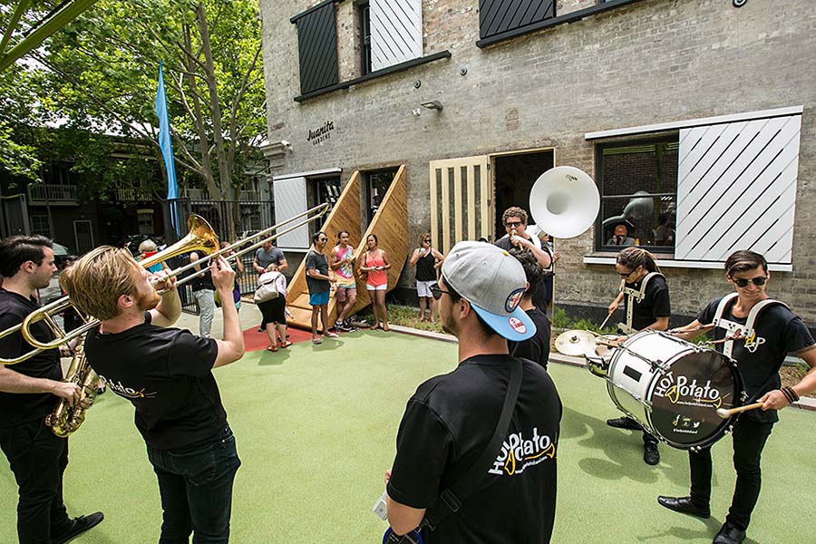
An adjacent laneway has been annexed as a new pocket park, allowing the community centre’s activities to extend outside and activate the street. The park can be a public space, open to the street at both ends, or completely closed off for exclusive use by the centre’s activities, e.g. for after-school and vacation childcare.

Revealing layers of history
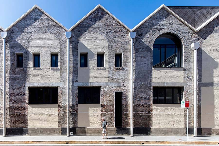
Alterations to the main “dressed” facades on Nicholson and Dowling streets return original openings, reinstate the missing pediment, and improve amenity by providing delicate steel entry awnings and light canvas shade awnings. External paintwork has been peeled back, revealing coloured layers of render. Alterations to the secondary “undressed” facades have been left visible, creating a rich patina that reveals the history of changes to the building.

The building retains and reveals surviving evidence of its original layout through applying a disciplined minimalist approach to new work. The alterations required to upgrade facilities and improve accessibility are focused in areas of less significance. Following conservation principles, new work is clearly distinguished from old with new services left exposed.

Using a playful zig-zag motif
The roof and ceiling had to be replaced, providing an opportunity to interpret the filigree quality of the remaining sawtooth parapet. The new roof geometry and timber ceilings draw on this motif with a repeating zig-zag.
The zig-zag motif used through the design has another source: it playfully evokes the memory of Juanita Nielsen (based on a top Juanita wore in a now-famous portrait). The motif appears in the timber ceiling lining, window screens and designs on doors, zig-zag shutters and striped black-and-white canvas awnings.

There has also been a comprehensive program of interpretation in the new work whereby layers of the place’s history are evoked throughout the building. Commissioned artworks have been informed by an interpretive strategy created by heritage consultant John Oultram in collaboration with City of Sydney historians. Text along Wilson Street in Gadigal language and English explicitly acknowledges the Indigenous community. A hall curtain by artist Locust Jones speaks of the Woolloomooloo reclamations; the former warehouse use is evoked in the palette of materials; and the infamous history of the centre’s namesake, Juanita Nielsen, all influence the centre’s design. This provides a playful and ornate layer of work alongside the otherwise stripped-back warehouse form.

The layout, form, materials, and colours of the project make subtle reference to the history of the site while providing a vibrant and welcoming new community space.
At the Juanita Nielsen Community Centre, we worked to achieve a rawness that would conjure the original warehouse quality – stripped brick, stripped render, exposed timber, new recycled timber, exposed steel – looking for that sense of time through material.
Rachel Neeson, Neeson Murcutt Architects
Working hand in hand with sustainability
The project’s heritage and sustainability goals work hand in hand. By re-using and adapting an existing building, considerable resources have been saved though retaining fabric and improving performance.
Passive cooling is achieved using natural ventilation and ceiling fans, rainwater tanks supply water for irrigation and toilets, and an in-slab hydronic heating system serves the central ground-floor areas. Energy used to air condition the gym is offset by roof-mounted solar panels and an off-site renewable energy strategy.
Lessons learnt
The building’s performance has been improved and the ways it can be used increased, without changing its essence. This was achieved by a respect for original fabric first and foremost and an approach to new work that focused on the needs of its community of users. This required flexibility in detailing whereby new work had to fit within the unpredictable context of the historic building. As the architect noted:
Nothing in the building was vertical or plumb. We had to develop an attitude of loose fit for all our detailing and call on the assistance of the structural engineer and heritage architect regularly throughout the build.
Rachel Neeson, Neeson Murcutt Architects
